Risknet Dashboard Redesign
Risknet is a cloud-based commodity risk management platform used by organizations to monitor exposure, manage volatility, and make time-sensitive decisions. While the platform contained accurate and comprehensive data, the existing dashboard made it difficult for users to quickly understand system state or identify what required attention. I led a redesign of the Risknet dashboard to reduce cognitive load, clarify information hierarchy, and better support day-to-day decision making.
Problem
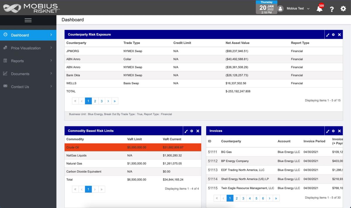
The existing dashboard surfaced large volumes of data but did not support fast orientation or decision flow.
Key issues included:
- Dense, table-heavy layouts with little visual hierarchy
- Critical signals buried alongside secondary information
- High cognitive load for both new and experienced users
- Limited sense of what had changed or required action
Users could access the information they needed, but doing so required interpretation, familiarity with the system, and frequent context switching. In a risk management environment, this friction slowed decision making and increased the chance of missed signals.
Solution
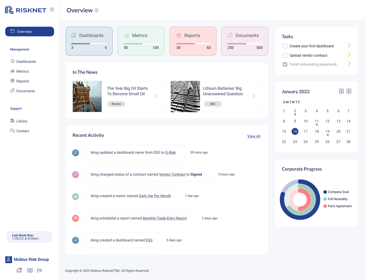
I reframed the dashboard around system state and user intent rather than raw data presentation.
The redesign focused on:
- Surfacing high-level system context first, with clear paths to deeper detail
- Establishing a clear information hierarchy so important signals were immediately visible
- Grouping related platform concepts to reduce scanning and mental overhead
- Providing temporal context through recent activity and system changes
- Maintaining a stable, predictable layout appropriate for high-stakes workflows
The dashboard was designed to act as an entry point into the system rather than a dense reporting surface. Design decisions were made in close collaboration with engineering to ensure the interface reflected real system behavior and data constraints.
Outcome
The redesigned dashboard improved how users interacted with Risknet on a daily basis.
Observed outcomes included:
- Faster orientation
Users could quickly understand system status without scanning large tables. - Clearer signal prioritization
Important information was surfaced immediately instead of inferred. - Reduced cognitive load
Navigation required less platform familiarity and fewer context switches. - Improved feature adoption
Metrics, reports, and documents were easier to discover when presented in context.
Support feedback shifted away from “where do I find this” questions toward more substantive product discussions, indicating improved clarity and usability.
Visuals